Capturing Soul in
Every Frame
Cameron Karsten Photography
Brand Identity
+
Cameron Karsten is an award winning photographer and director who shoots commercially for lifestyle clients worldwide.
He needed a modern identity system and visual language that captured a sophisticated purity and power found in his imagery as well as a language that did not interfere with his images.
CLIENT: CAM KARSTEN // DISCIPLINES: IDENTITY, PRINT, DIGITAL
+ Strategy
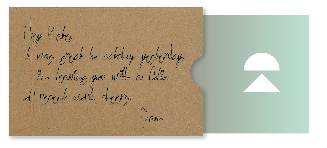
We began Cam’s design with his monogram letters. Taking the letter C and K and making a geometric and symbiotic relationship between the two letterforms. The negative and positive space created a great tension and focal point of the mark while the beacon shape of the letter K simultaneously symbolized light and image projection. The earthy color palette reflected the great outdoors that frequently appears in Cam’s work and we purposely used color in big simple solids so it was not competing with his imagery. Various applications showcased the CK mark and colors in minimal ways including some tactile and natural results like stickers and personalized business card envelopes with handwritten notes.


