Revolutionizing
Menopause Care
Gennev
Brand Identity
+
Gennev is a women-founded clinician-built menopause care platform that believes menopause is a rite of passage, and they believe it should be celebrated as such. That’s why they’re pushing women’s healthcare to find better solutions for midlife and beyond.
Gennev needed a brand refresh after the company’s initial beginnings. Evolving from a product company into a full telehealth offering required more depth and meaning behind Gennev’s brand and visual language. Our thanks to Molly Baker for her production collaboration.
CLIENT: GENNEV // DISCIPLINES: NAMING, IDENTITY, PACKAGING, PRINT, DIGITAL, SOCIAL

+ Strategy
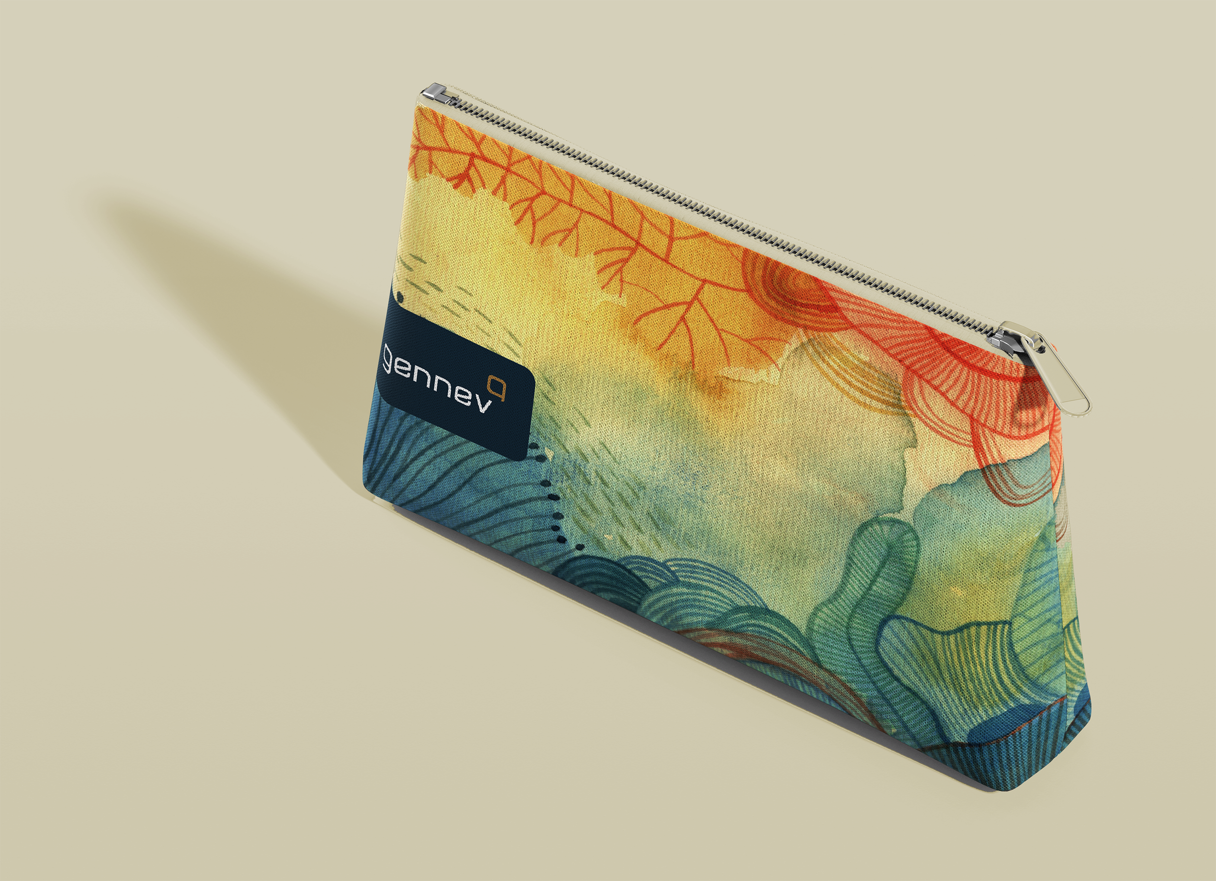
After a successful startup and starter brand, our approach to Gennev’s work began with bringing ease and meaning to their name. Dropping the “e” from the original name of Genneve for better pronunciation proved to be impactful. To this adjustment we focused on meaning, (Gen): a new generation of woman, new thinking, redefining a generation and (nev): from old Irish, Niamh that translates to neve—which means radiant and bright. We created a stylized conversation bubble as the new mark and then a new logotype which was designed around the company’s mantra of creating a “conversation” around menopause.
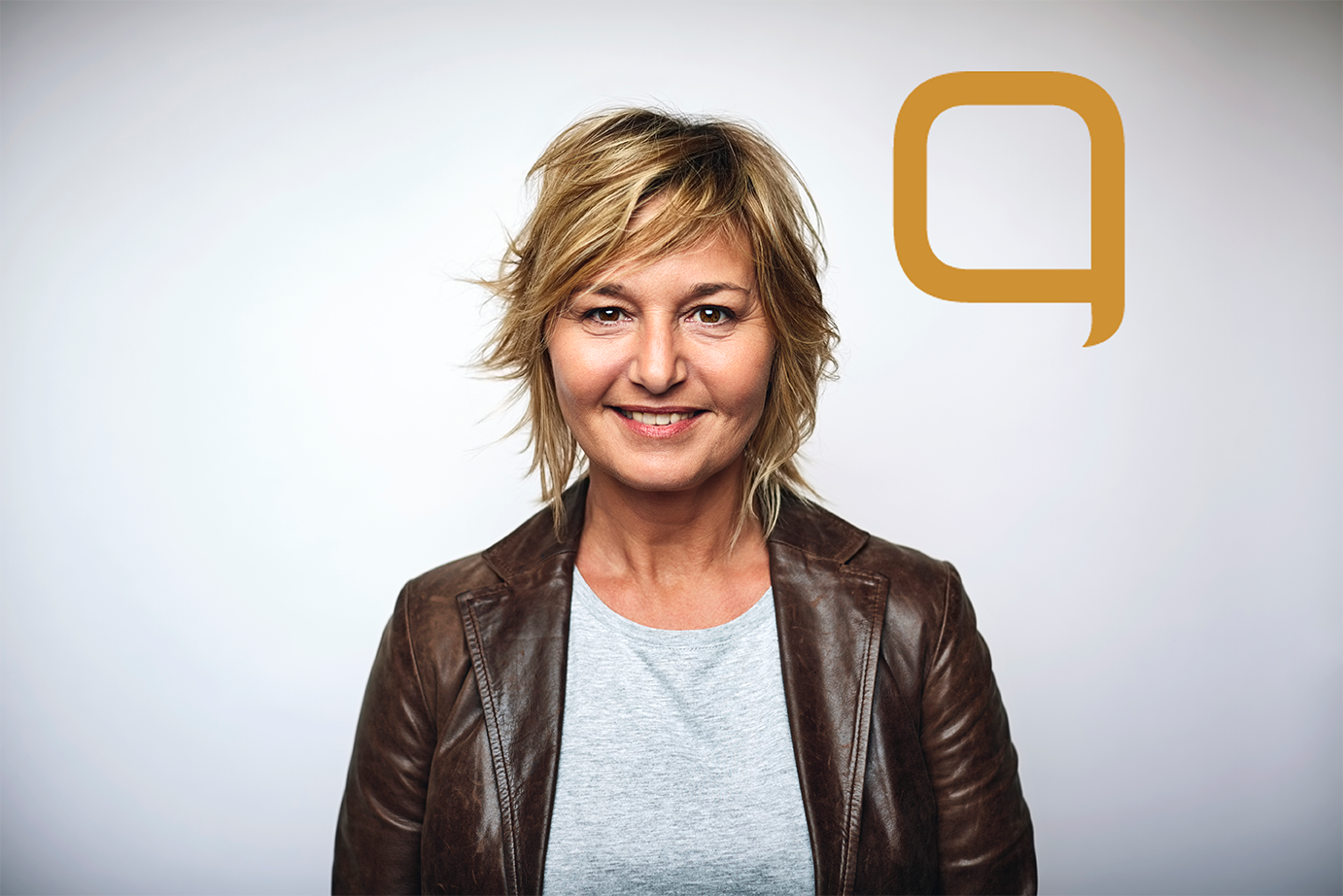
The brand’s beginning had started with products only and had a very clean but slightly clinical feel. We kept their navy color for legacy and recognition but also because it was strong. We extended the brand elements by adding warmer tones including organic illustration and a new color palette. The colors created a more “inclusive scheme” that spoke to all women. Photography needed to be authentic and honest in order to convey real women with a real lifestyle application. In all, the goal was to create a refresh that captured a sophisticated, pure and intelligent brand while balancing a bold company that was trail-blazing new paths in menopause care.


